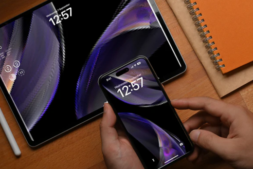
Do you recall the days when everyone used large, cumbersome desktop computers to browse the internet? Those times are over. Nowadays, you risk losing clients before they've even seen what you have to offer if your website isn't optimised for mobile devices.
People want your website to load quickly, look good, and be easy to use on their phone whether they're waiting for a train in Glasgow, on the bus in Manchester, or sipping coffee in Shoreditch, as mobile devices account for more than 70% of all web traffic in the UK.
Why Mobile-First Matters
Initial Impressions Matter
People won't stay on your site if it appears antiquated or unprofessional on a mobile device. A simple, mobile friendly design gives you an instant credibility boost.
Google Reward It
Mobile friendly websites rank higher in Google's search results. This implies that focussing on mobile devices initially can help you rise in the rankings by attracting more visitors and potential clients.
Quick Sales
Nobody wants to wait for a page to load, pinch, or zoom in. A mobile website that is optimised loads quickly, maintains user engagement, and increases the likelihood that users will take action.
How to Launch with Mobile
Make the navigation easy so that users can find what they need with a single tap or two.
Make use of responsive design to ensure that your website works flawlessly on all screen sizes.
Make films and pictures load faster without compromising quality.
Bottom line?
It is now essential to have a mobile-first website rather than just a "nice-to-have." Your website must function flawlessly on the phone, which is the device that your clients use the most, if you want to remain competitive.